
Arcus AI Brand Guidelines
Design system and visual identity standards for Arcus AI
🎨 Brand Overview
"Arcus" comes from Latin, meaning arc — the curve of reach, the bridge between two points, the trajectory of something in motion. It captures exactly what we do: connecting businesses to their audiences, extending their reach, and building the digital presence that propels them forward. Paired with the AI suffix that reflects the technology at the heart of everything we build, Arcus AI is sharp, memorable, and built to last — a name that works as hard as we do.
Brand Personality: Cutting-edge, powerful, confident, accessible
Visual Style: Modern dark theme with vibrant gradients, glassmorphism, and dynamic animations
Target Feeling: Users should feel they're using the most advanced AI technology available
🖼️ Logo & Brand Mark
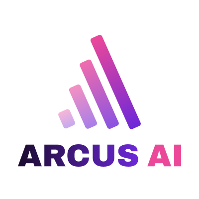
The Arcus AI brand mark consists of two elements: the signal bars icon and the ARCUS AI wordmark. These may be used together in horizontal or stacked layouts, or the icon may be used independently for favicons, app icons, and social avatars. Never alter the colours, proportions, or typeface of any logo variant.
Primary Logo — Horizontal
Stacked Logo — Square Format
Use when a square or near-square canvas is required — social media profiles, app tiles, favicons at larger sizes.
Icon Mark
The signal bars icon may be used independently where the full wordmark is impractical — browser favicons, app icons, watermarks, and social media avatars at small sizes.

🎯 Icon Mark Rationale
The signal bars icon was chosen as the Arcus AI mark for several converging reasons. Most literally, signal bars represent reach — the expanding radius of connection between a business and its audience, which sits at the heart of what Arcus AI does. The descending step pattern also carries a secondary meaning: it echoes data, analytics, and measurable digital growth — exactly what we deliver for clients. Visually, the four bars give the mark strong scalability — it reads clearly at favicon size and holds its weight alongside the bold Archivo Black wordmark without competing with it. The gradient running pink-at-top to purple-at-base ties the icon directly to the brand palette, making it feel like a designed system rather than a generic symbol. Finally, the stepped geometric form sits in a space that feels both technological and approachable — sophisticated enough for a premium AI agency, but immediate enough that a local SME client intuitively understands what it represents.
Logo Usage Rules
✓ DO
- Use the correct version for the background colour
- Maintain clear space equal to the height of the "A" in ARCUS on all sides
- Use the stacked version for square formats
- Use the icon mark alone only at small sizes or where space is limited
- Download and use the original SVG files to preserve quality at any size
- Use the transparent version on gradients — check contrast first
✗ DON'T
- Don't recolour, outline, or add effects to the logo
- Don't stretch or distort any logo variant
- Don't place the dark version on a light background
- Don't place the light version on a dark background
- Don't rearrange the icon and wordmark
- Don't use the icon mark as a replacement for the full logo in large formats
- Don't add drop shadows or glows to the logo
🌈 Color Palette
Primary Colors
Background Colors
Text Colors
Gradient
✍️ Typography
Font Stack
Heading Text : Archivo Black
Body Text : Inter
Type Scale
📐 Spacing System
🔘 Components
Buttons
Cards
Example Card
Cards use glassmorphism with subtle borders and hover effects to create depth and interactivity.
✨ Effects & Animations
Glassmorphism
Used for cards and UI elements to create depth
Gradient Animation
Subtle gradient shifting for buttons and headlines
Shimmer Effect
Light sweep across buttons on hover
Floating Orbs
Ambient background animation
📏 Layout Guidelines
Max Width
Content Container: 1400px
Text Content: 1000px (for hero sections)
Narrow Content: 800px (for articles/long-form)
Grid Systems
Border Radius
Cards: 24px
Buttons: 50px (fully rounded)
Small elements: 8-12px
✅ Dos and Don'ts
✓ DO
- Use the gradient for primary CTAs
- Keep backgrounds dark (#0a0a0f)
- Use white text at 70-100% opacity
- Apply glassmorphism to cards
- Use rounded corners (24px for cards)
- Animate on hover for interactivity
- Use system fonts for performance
✗ DON'T
- Don't use light backgrounds
- Don't use pure black (#000000)
- Don't use more than 3 colors per section
- Don't use sharp corners on large elements
- Don't use the gradient as a background
- Don't over-animate (keep it subtle)
- Don't use custom fonts (slows loading)
🎯 Key Design Principles
1. Modern & Bold
Use vibrant gradients, large typography, and confident messaging. This is cutting-edge AI—the design should reflect that.
2. Depth & Dimension
Layer elements with glassmorphism, shadows, and hover effects. Create visual hierarchy through elevation.
3. Smooth & Fluid
All transitions should be smooth (0.3-0.4s). Animations should be subtle and purposeful, not distracting.
4. Performance First
Use system fonts, optimize animations, and ensure fast load times. The site should feel as fast as the AI it represents.
5. Accessible
Maintain sufficient contrast ratios. White text on dark backgrounds provides excellent readability.
📱 Responsive Breakpoints
🚀 Quick Start Code
Essential CSS to get started with the Arcus AI design system: